![]()
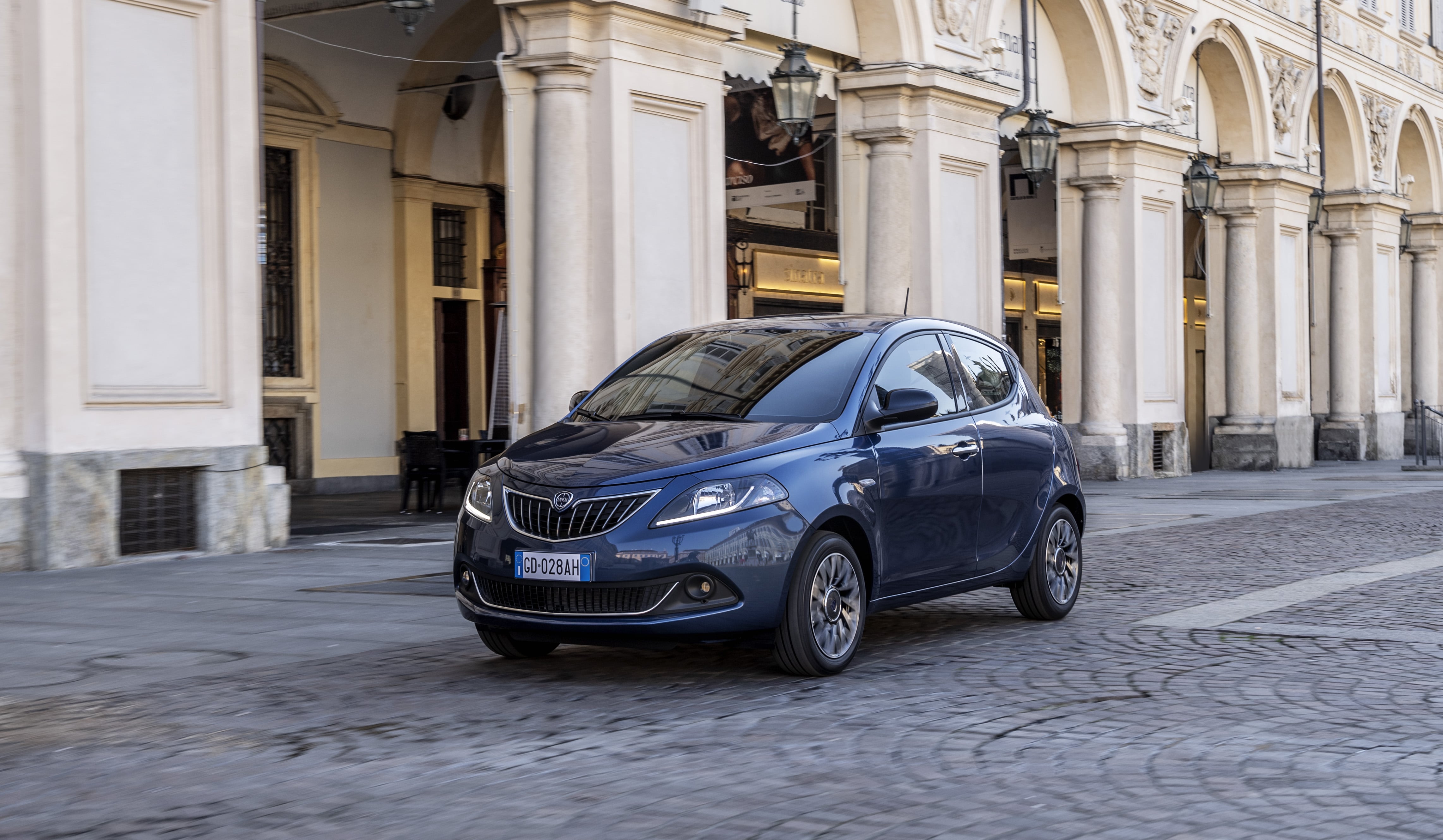
When we all believed that Lancia was past, Stellantis is born and gives it a future. The Italian house is not in its best shape, but the Ypsilon has proven to be a really tough "warrior". In fact, it's the reason why the executives of the Italian-Galic-American conglomerate are giving him another chance. And a few hours ago we had the opportunity to Meet your renewed logo and new aesthetic concept that its future models will wear.
Along with them, in addition, Lancia has shown a new prototype: the Pu+Ra Zero. However, it is not a car to use as other brands have accustomed us in other situations. It's more of a sculpture hidden in its lines what the design of the new iterations of the Ypsilon and Delta will look like. However, do not think that in this sculpture you will see their respective designs, although it is a good preview of all their work.
The Lancia Pu+Ra Design concept derives from "Puro" and "Radical"

So that you understand the design concept Lancia Pu+Ra Design we will tell you certain secrets. And more because we will also tell you in which part of the sculpture they are…
- Grill and light signature: The goblet-shaped grille of the legendary Lancias has been reinterpreted and accompanied by the Y-shaped daytime running lights. These three lines, according to the brand, suggest its rebirth and commitment to electric mobility.
- Lancia lettering instead of the shield: The front will do without the renewed logo and will be presided over by the spellings that name the brand.
- Round posterior optics: They are based on those of the mythical Stratos and the first model of the brand that will wear them will be the Ypsilon. In addition, another “Lancia” inscription also appears between them with the new typeface…
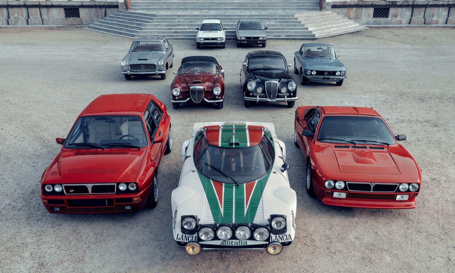
- Lancia logo on the side: Emulating the design of the mythical Aurelia B20, Flaminia the firm rescues the logo by placing it on the "B" pillar.
However, we cannot ignore that the firm founded by Vincenzo Lancia launches its logo in 2024. In case you didn't know, it is the seventh evolution in the more than 110 years of history of the Turin house. Also, it will be in the new Ypsilon when they will open it. Regarding its design, its renewed lines are inspired by the ones that the logo that the Falaminia premiered in 1957 wore. In any case, to give it more entity, they have explained its meaning…
According to Lancia's press release...
«The new Lancia logo is Progressive Classic since it takes up all the distinctive elements of the historical logo, the wheel, the flag, the shield, the spear and the spelling, reinterpreted to modernize them and project them into the future»
As a curiosity, the new spelling of the brand is inspired by fashion. In addition, they express what the purpose of this new logo is…
"It is the symbol of the new era of Lancia and marks its entry into electric mobility..."
All in all, we can't wait to see what the future of Ypsilon and its siblings will look like. If they keep what they promise, prepare their Bavarian premium rivals...
Source - spear


More information about this model
- Plazas 4 - 5
- Power 70 cv
- Consumer goods 5,3 - 5,4l/100km
- Assessment 3,5