![]()
La commercial image of a brand, no matter what you do, it is something that is taken care of to the millimeter. The automobile sector is not exempt from this problem and firms do everything possible, and impossible, so that customers differentiate them from the enormous competition. The former English house Mini, traditionally, has been known for two reasons: for the design and size of their cars and logo that has accompanied them throughout their history, the name of the firm inscribed in a circle on outstretched wings.
After his return to life, now in the hands of BMW, the Mini logo became three-dimensional and have a more, let's say, premium format. However, in marketing there is a maxim that is not always fulfilled: “sometimes, less is more”. This, in terms of design, is explained as follows: no matter how much something is recharged, it will not always be more attractive in the eyes of the client, being able to create the opposite effect on him, that is, that he is not attracted by the design of the element in question; in this case, the logo of a brand.
Following this premise we have a clear example: the image change strategy that the PSA Group has carried out with Opel after its acquisition of General Motors (although many and varied things would have to be clarified here). For this reason, Mini has decided to give its logo a twist, to launch a renewed and simpler one in March of next year.
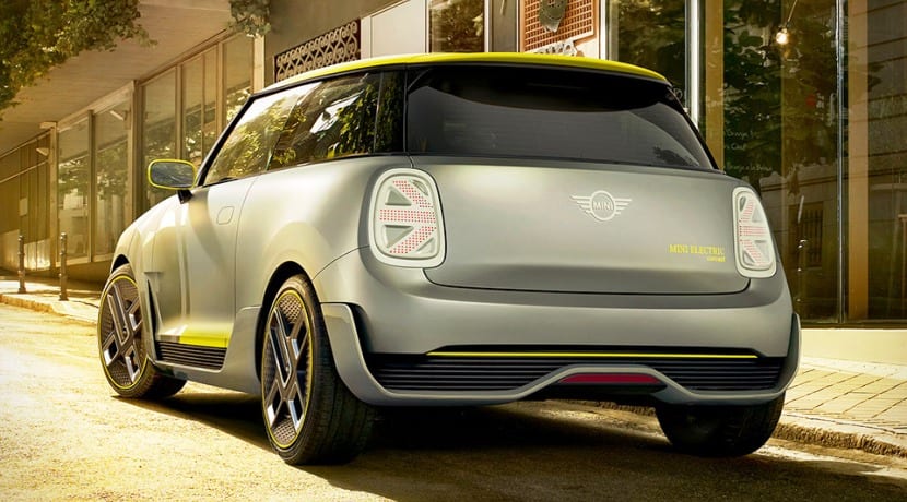
At, Mini it leaves behind the chrome and the three-dimensional effect to move on to one with a format in two planes and a black design. According to the firm, with this new logo they want to convey greater authenticity and clarity to the customer. This design has been advanced by the brand in several of the latest concepts that it has presented to the public, so the step they have taken for its implementation has not surprised us.
Another of the reasons that have been communicated for its use is that by having a simpler design, it will be easier to place it in the noses and gates of their cars (translated in another way, a lower unit cost per logo and therefore a small increase in unit profitability). In any case, with his arrival a new era is inaugurated in the firm, and more so now that drastic changes are coming, such as the electrification of its models.
Source - Mini

More information about this model
- Plazas 4 - 5
- Power 136 - 231 hp
- Consumer goods 5.5 - 6.9l/100km
- Assessment 4,1